Monie Bank
UI design for a challenger
online banking app
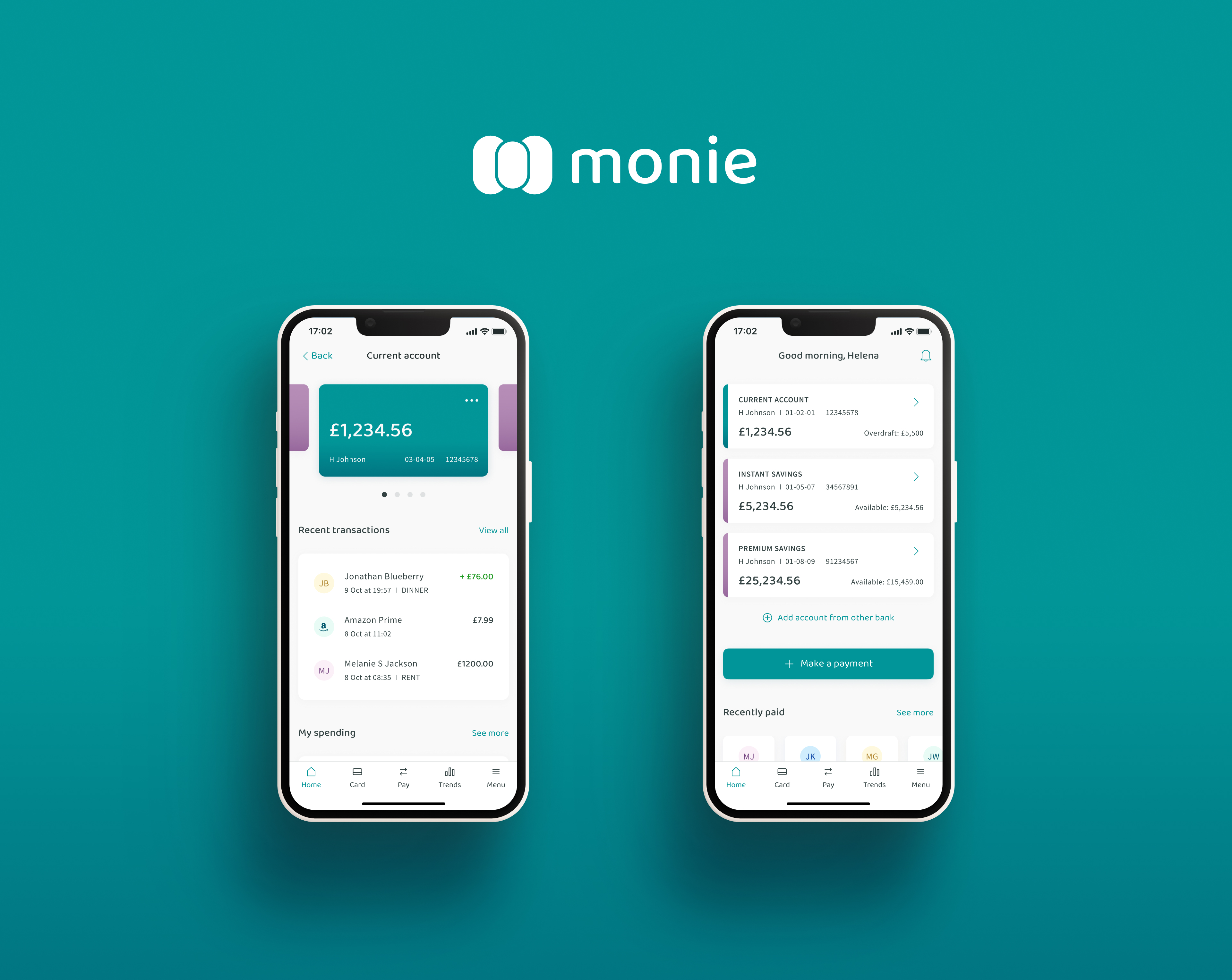
Monie is a new challenger bank looking to make waves in the financial world. They aspire to surpass the likes of Monzo and Revolut in the crowded market of online banking. To be able to get there, first, they needed an intuitive app that will help them stand out from the crowd.
My task was to design the app UI that works responsively across mobile, tablet and desktop. I was provided with simple initial wireframes, as well as the core brand values as a starting point: playful, clean, and trustworthy. Based on these, I’ve designed the logo, colour palette, and the entire app user interface from the ground up.
- Project by
- UXDI
- My role
- UI Designer
- Duration
- 8 weeks
- Key tools
- Figma, Photoshop, Illustrator
Colour palette
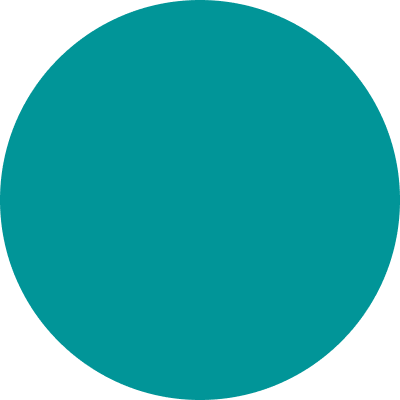
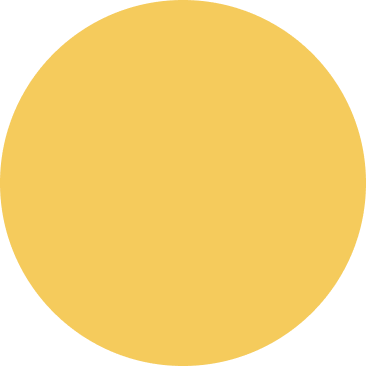
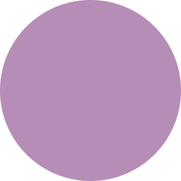
Inspired by the northern lights
For the main brand colour, I’ve had a rich combination of blue and green in mind. Blue represents security, reliability and trust – while green stands for optimism, energy and wealth (money). What else could be a better message for a brand new challenger bank?



Typography
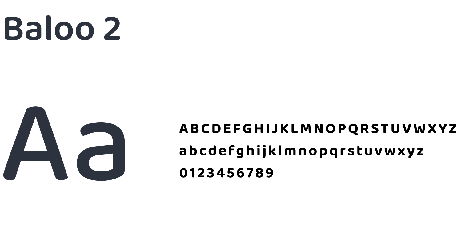
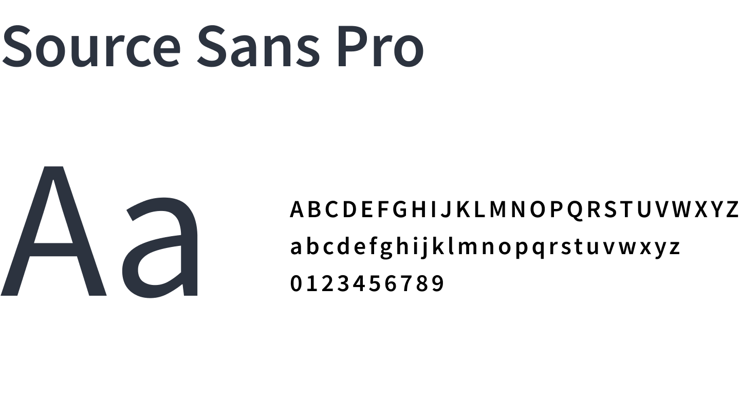
The display typeface (Baloo 2) offers just the right level of playfulness. I’ve combined it with a modern, clean body type, designed specifically for user interfaces (Source Sans Pro).
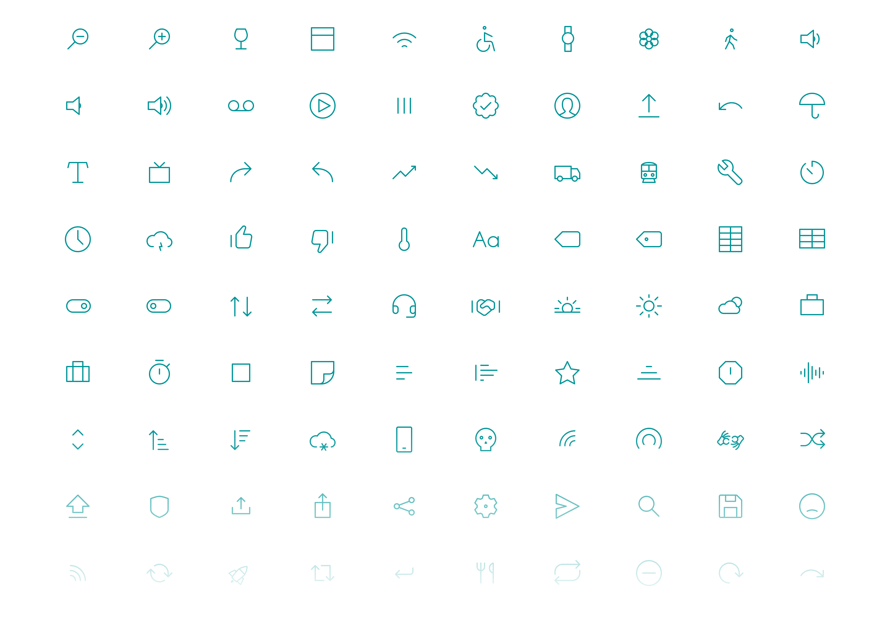
Iconography
A warm welcome
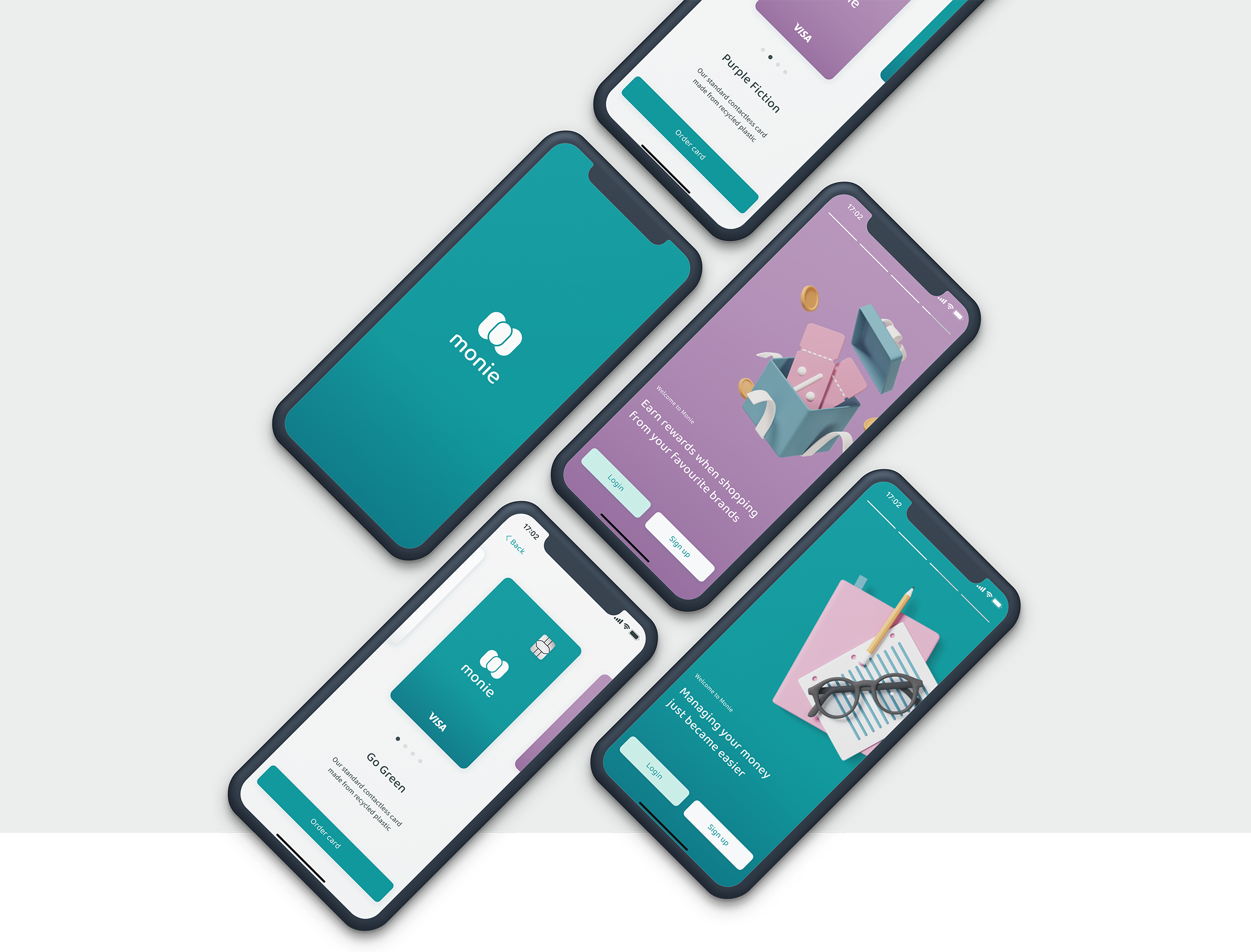
Friendly onboarding experience with colourful splash screens and a clean, user-friendly signup process.
Easy access to main features
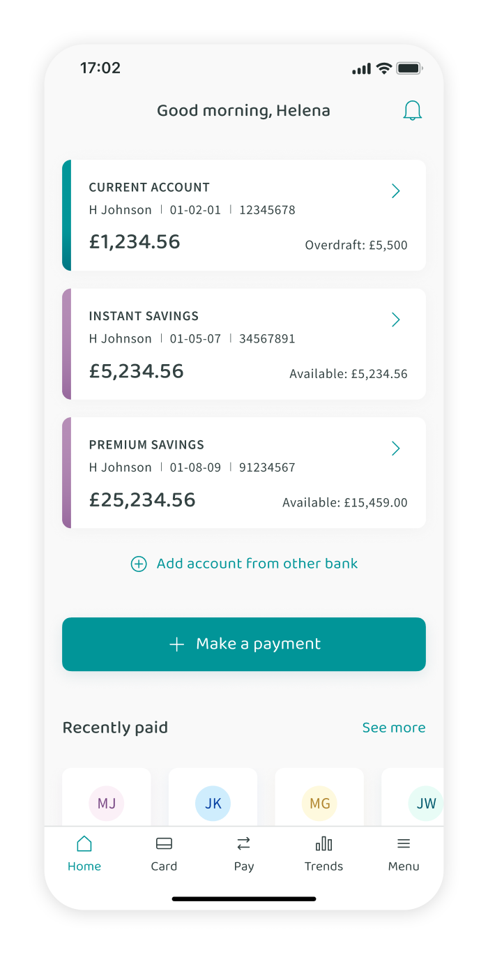
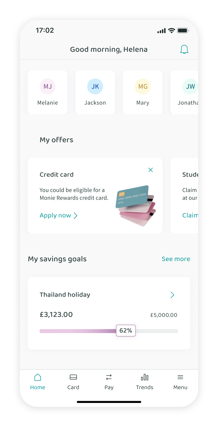
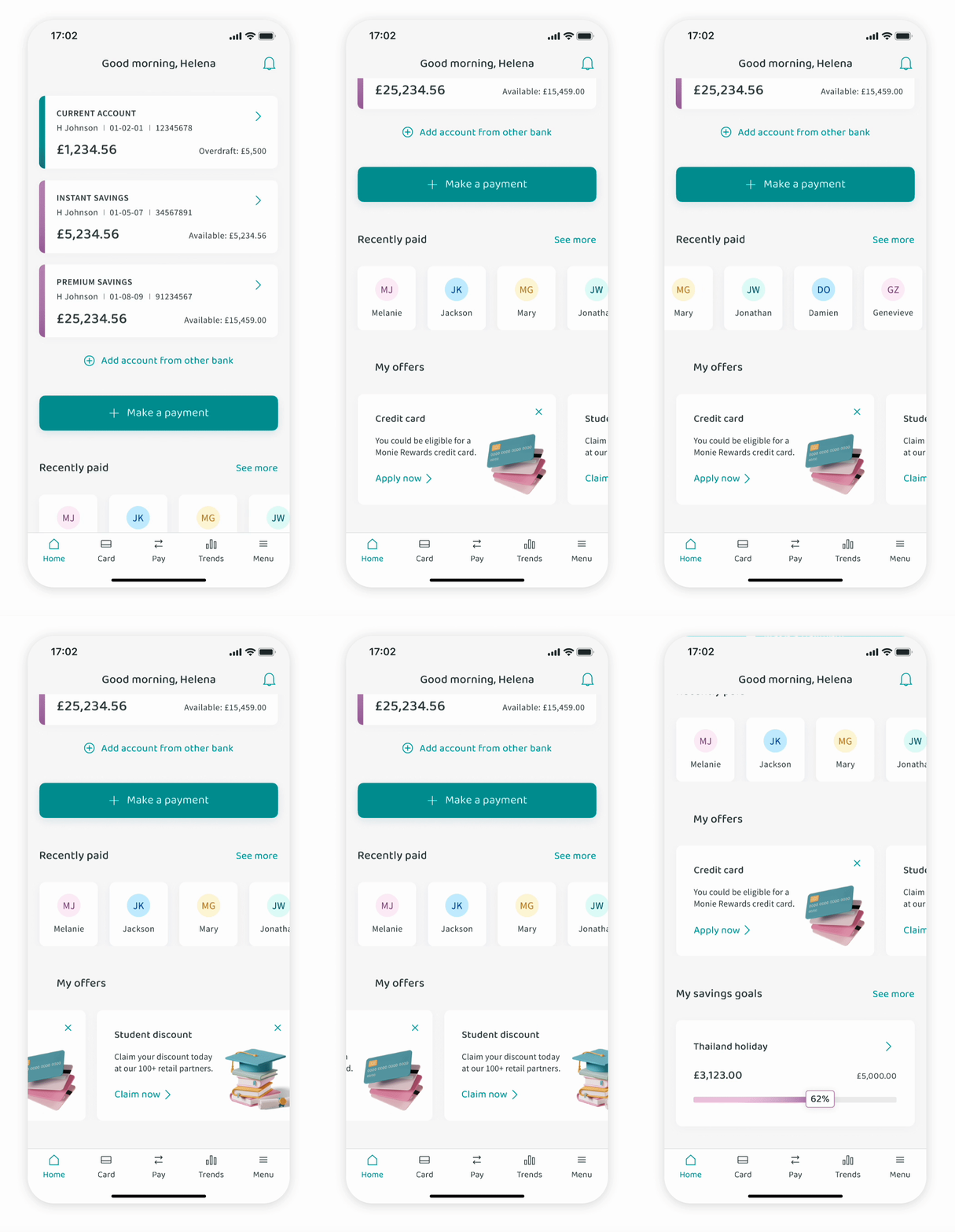
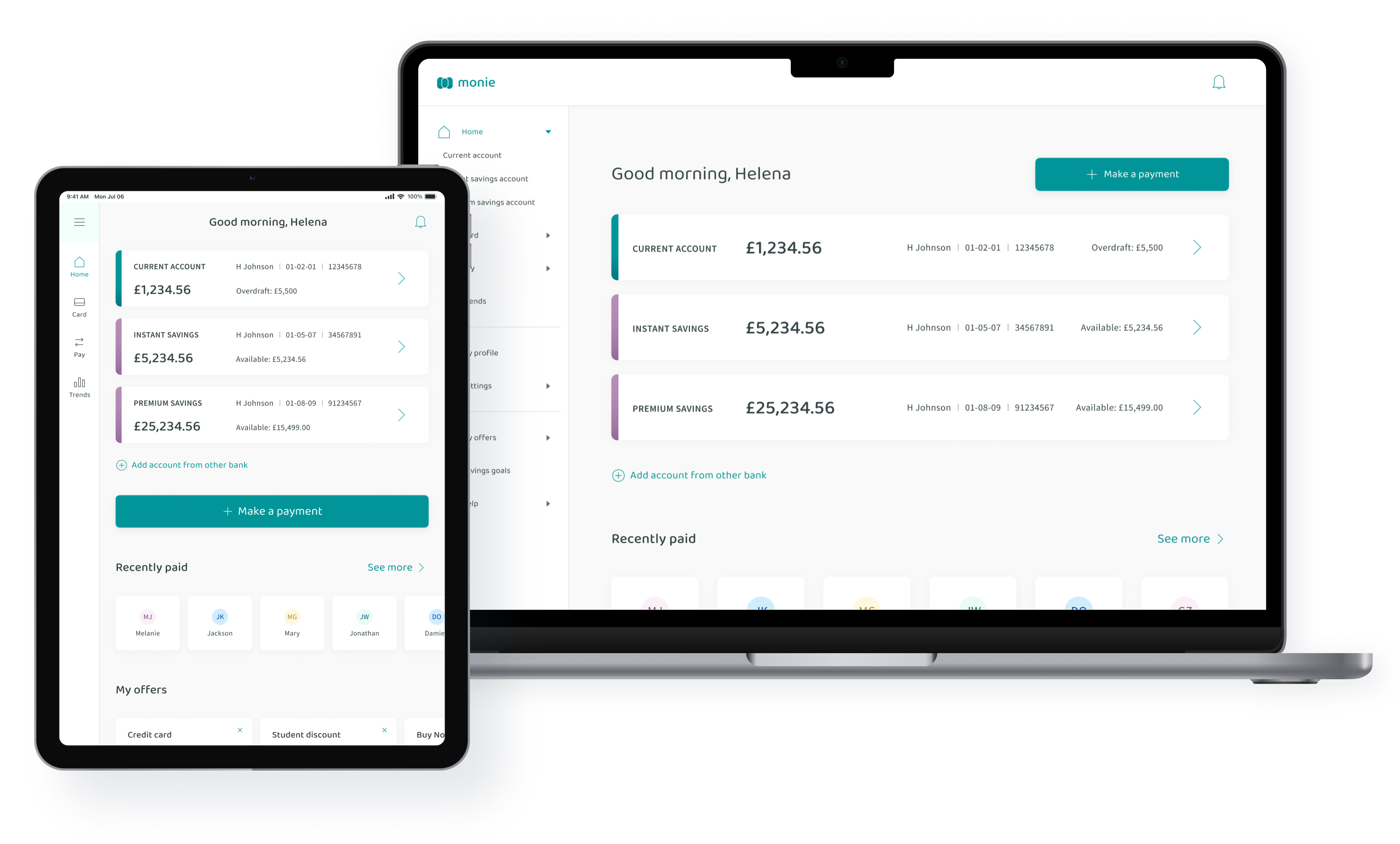
A clean, functional home screen with easy access to all your accounts, quick payment and recent payees.
Switch between
accounts quickly
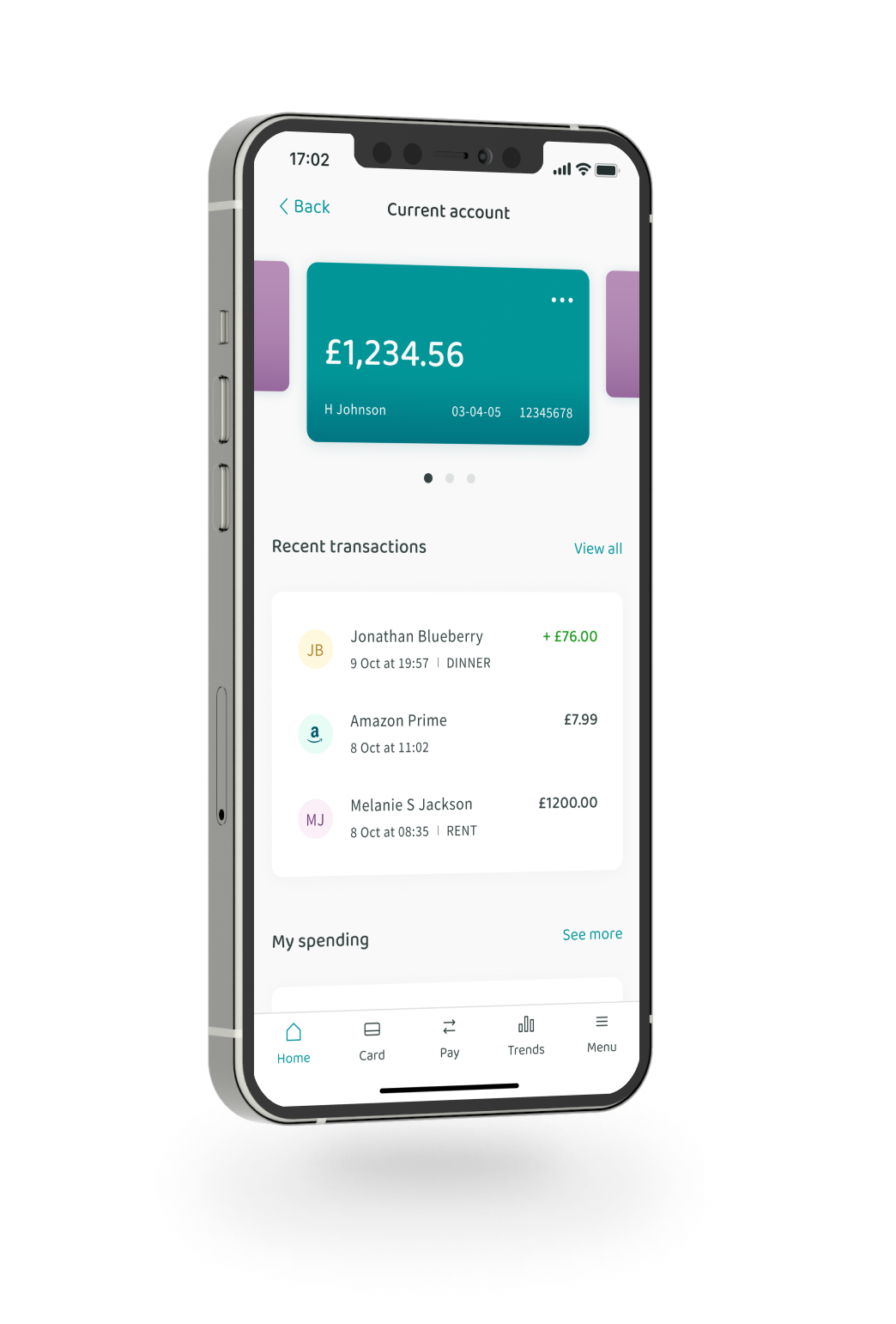
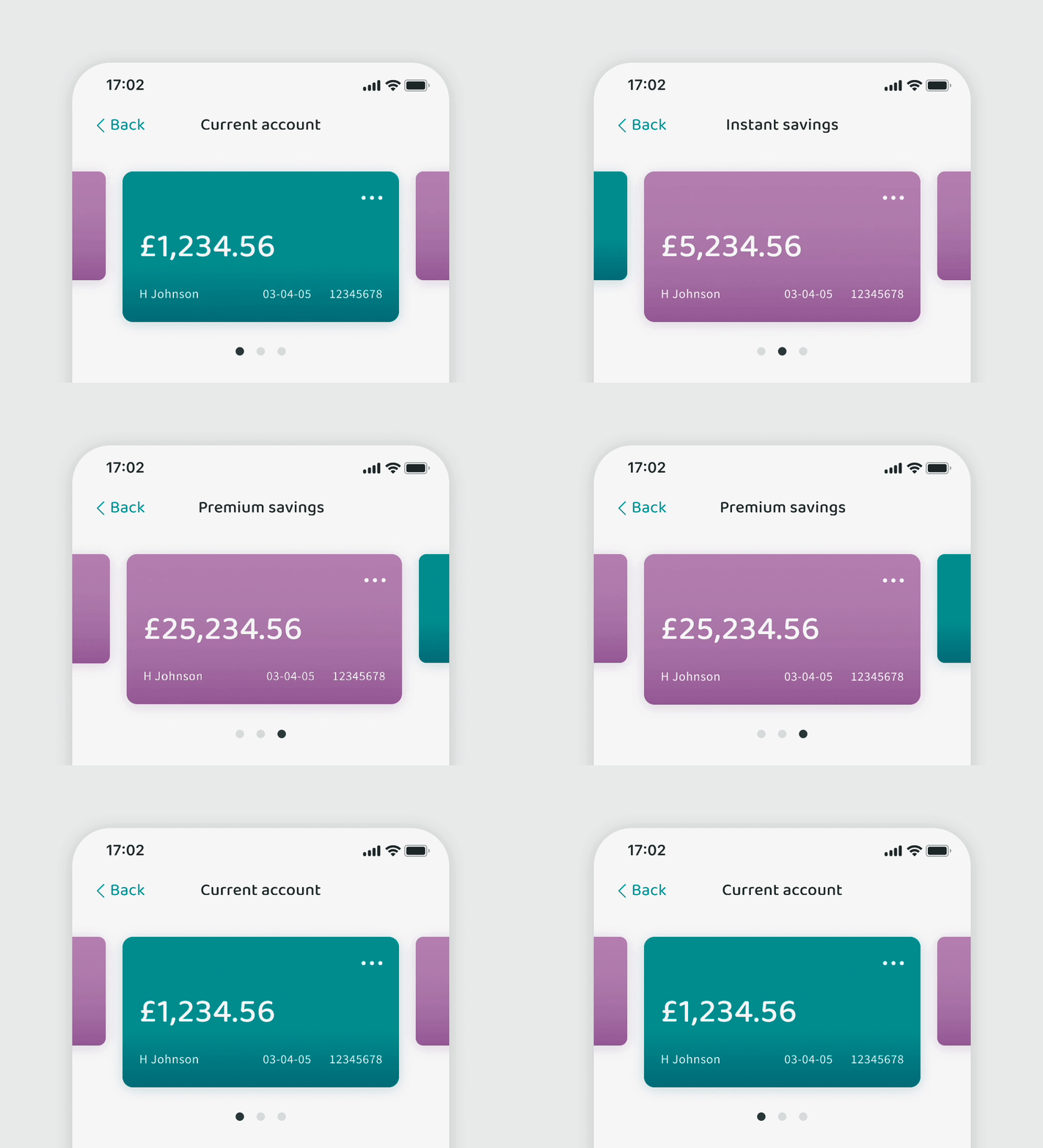
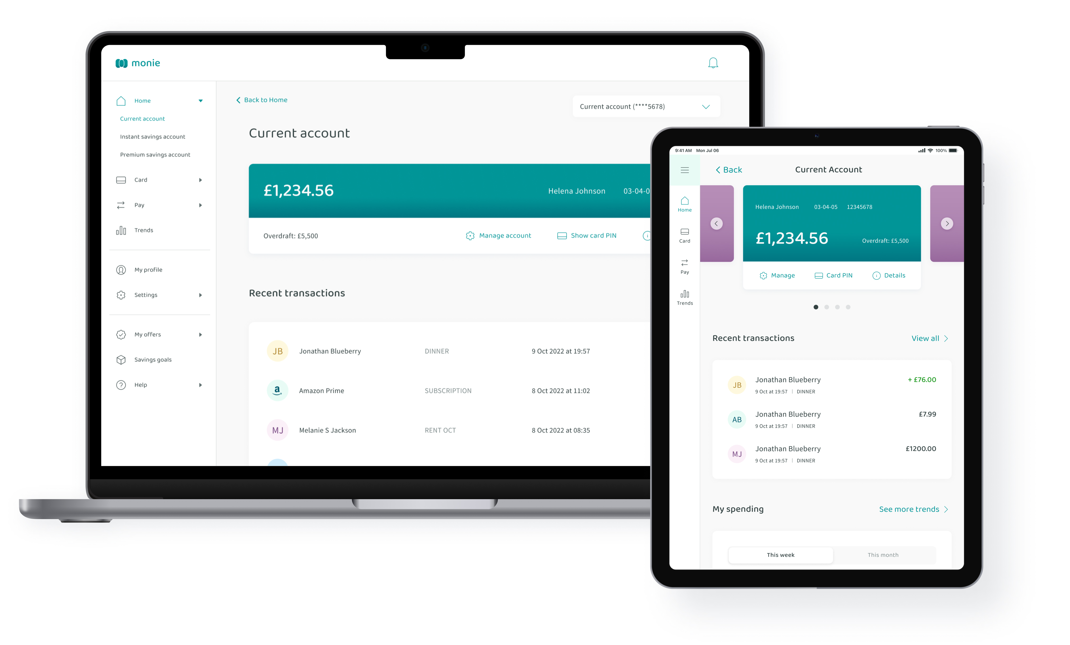
Upon selecting an account on the home screen, the user lands on the individual account’s screen. Instead of going back to Home to select another account, they can easily switch between their existing bank accounts.
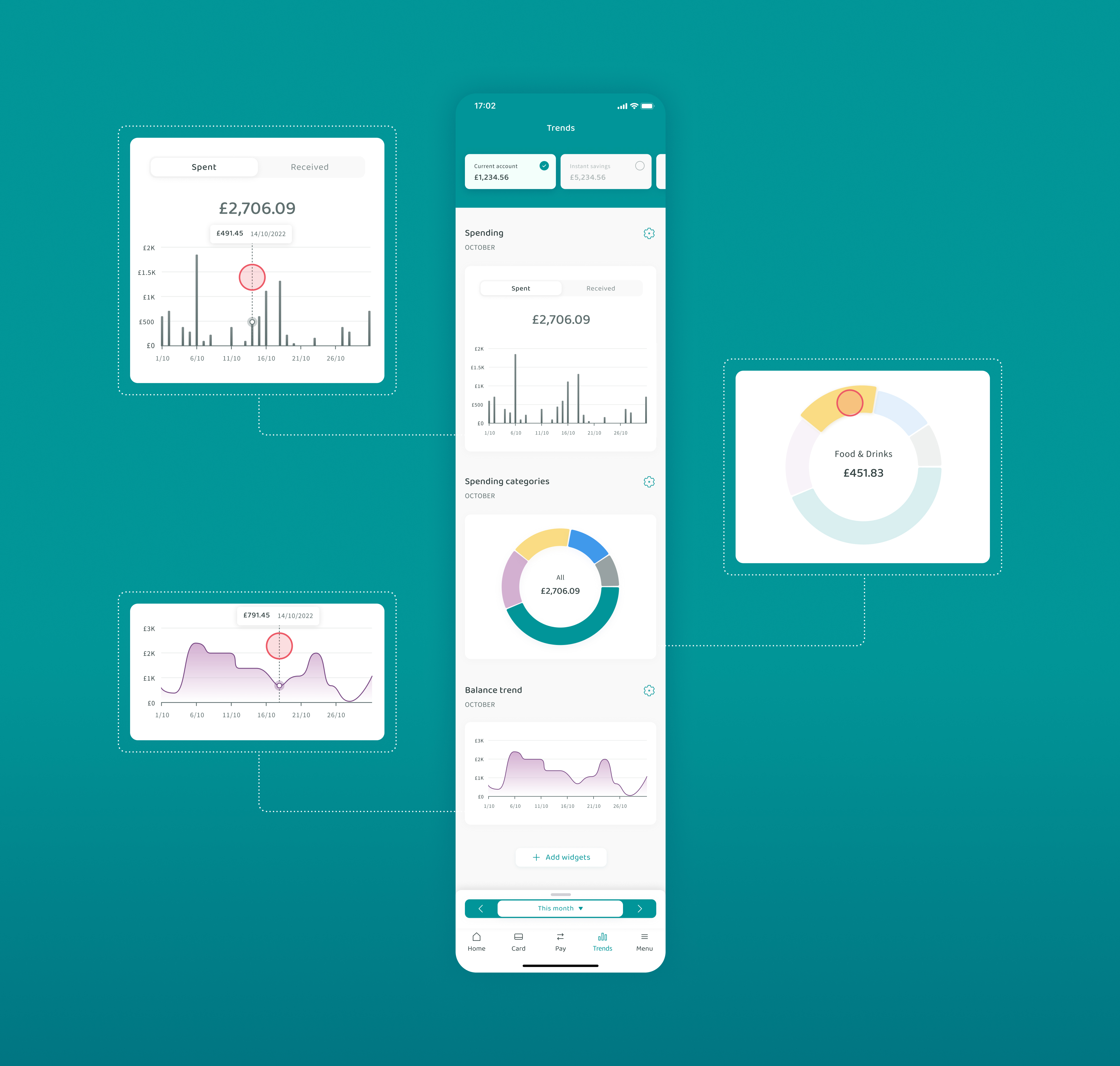
Spend smarter
Customisable, data-driven approach to help users understand where their money is going and how they can spend smarter.
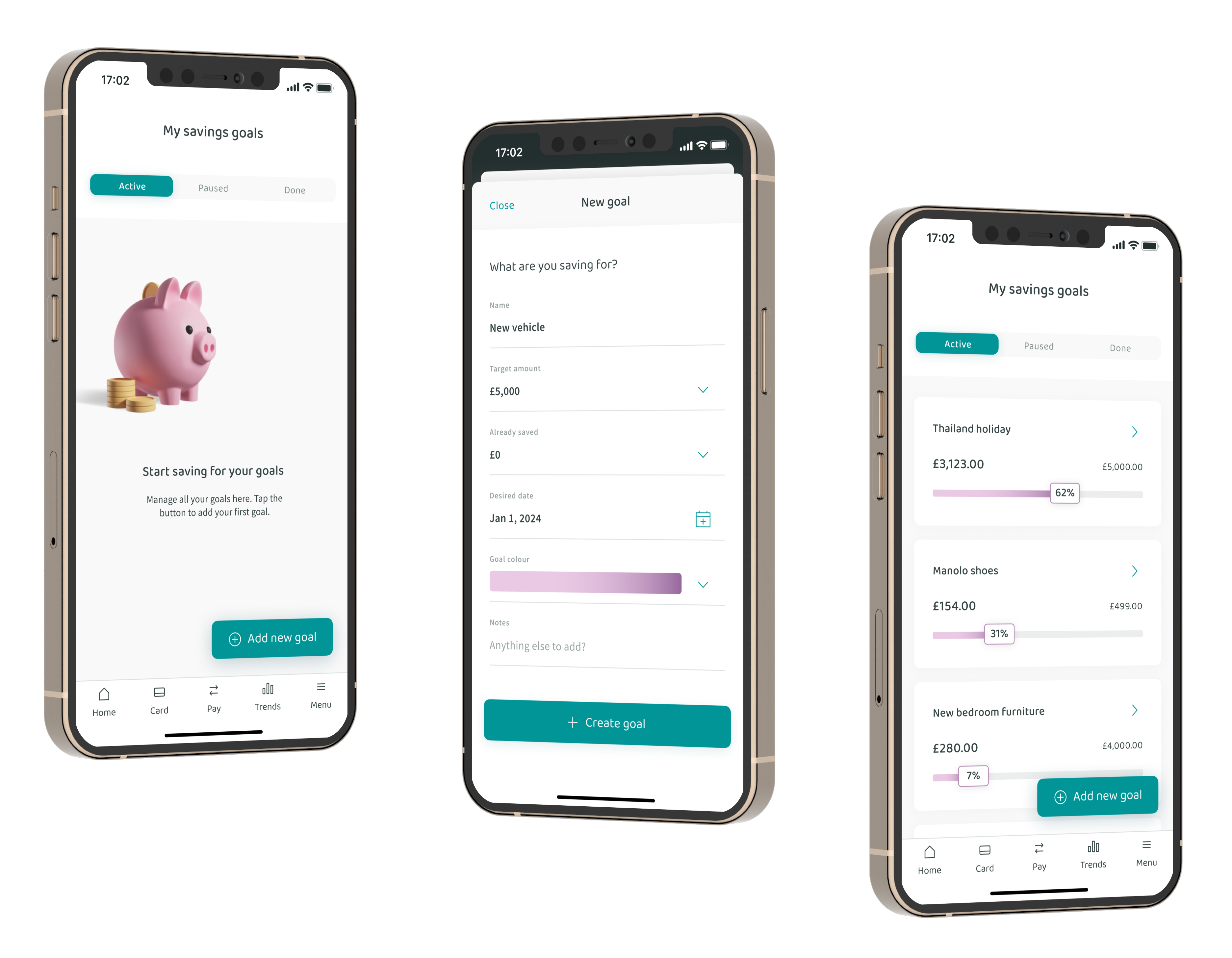
Start saving for your goals
Simple, intuitive functionality to log and track savings goals, including active, paused and already completed goals.
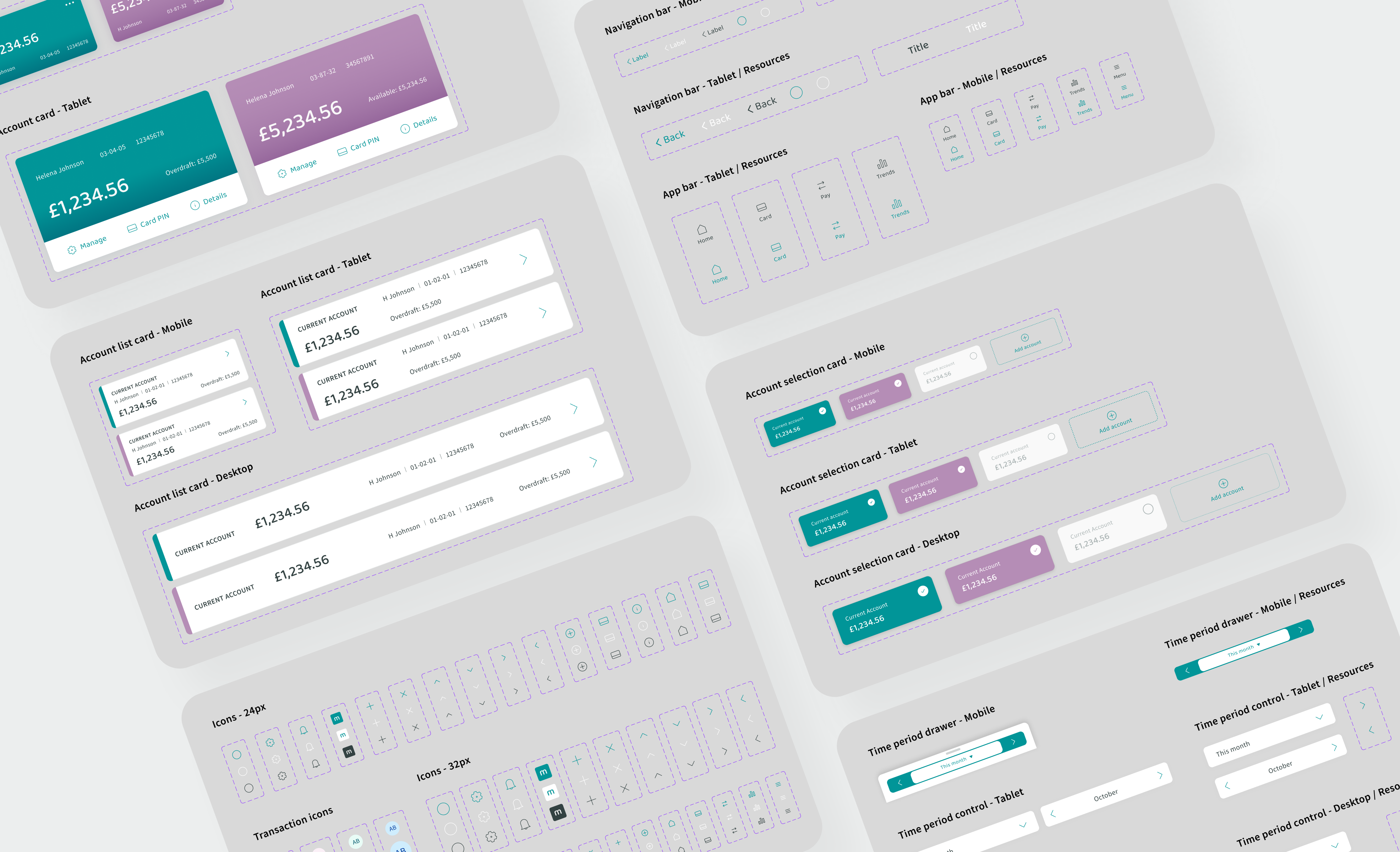
Design system in progress
I’ve designed 100+ reusable components and variants to ensure a consistent approach throughout my design process.
Responsive app
Following a mobile-first approach, the final step in the process was to design the mobile app for different devices, including tablet and desktop.
Conclusions & next steps
My favourite part of this project was designing a complex user interface from scratch. In most cases, you need to work with an already established brand and design system. Being able to design this app from the ground up was a really unique opportunity and I enjoyed every minute of it.
The key thing I’ve learned during this process was the importance of regular feedback and collaboration. When you’re creating a brand new user interface with hundreds of new components, it becomes even more crucial to listen to others. The next step in this project is to conduct user testing sessions on high-fidelity prototypes and fine-tune the UI based on user feedback.
If there was more time, I would spend it on creating animated high-fidelity prototypes even for the less frequently used parts of the product. This would enable me to test them with users and receive even more valuable feedback.
